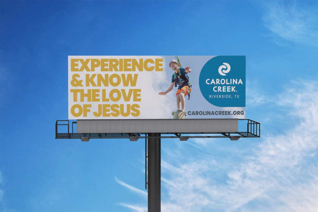
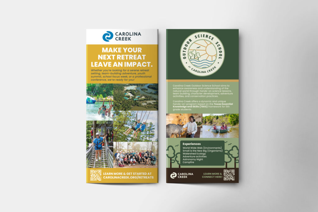
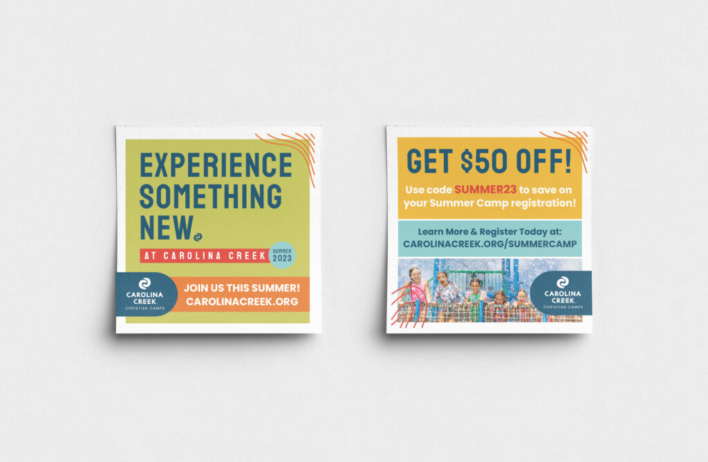
This ongoing project involved developing a flexible, cohesive visual system for Carolina Creek’s marketing across print, digital, and environmental platforms. The goal was to refresh the brand’s presence while maintaining its mission: to invite individuals to experience and know the love of Jesus.
Deliverables:
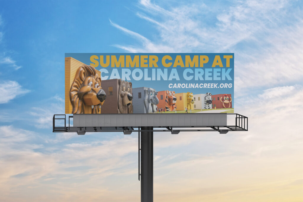
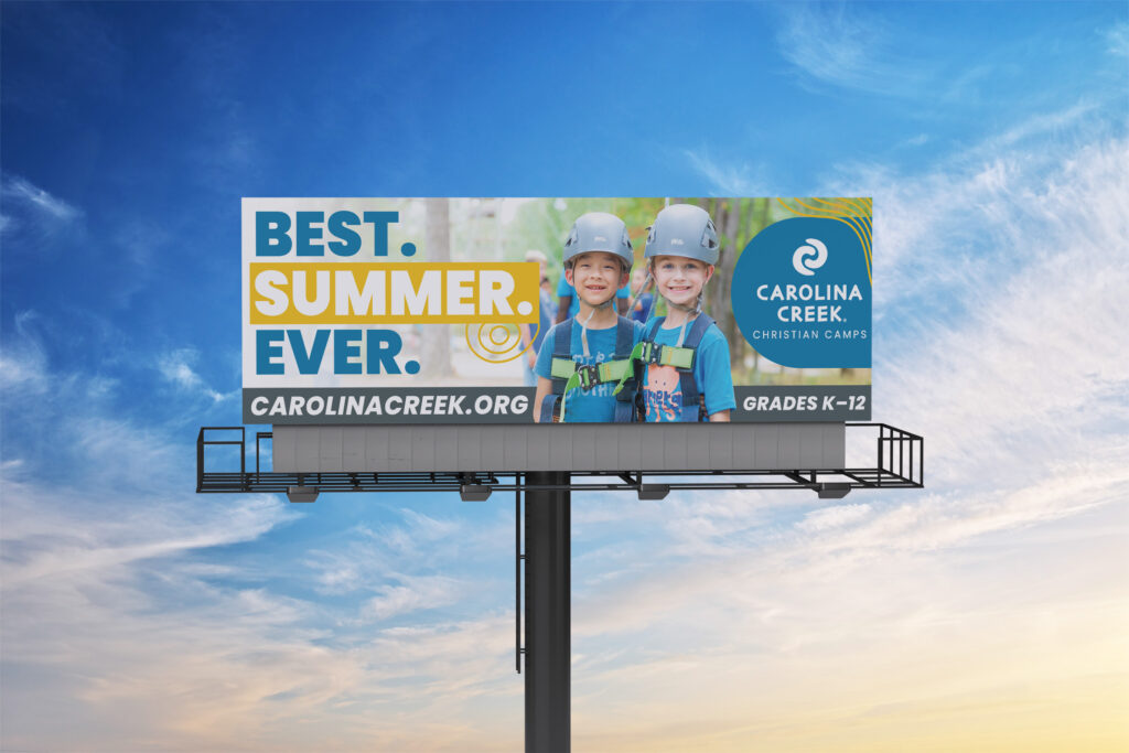
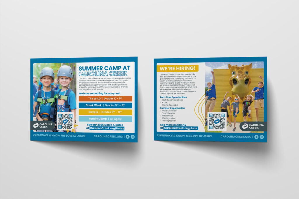
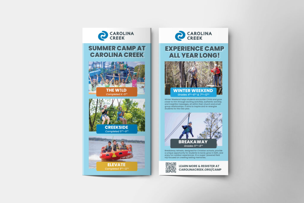
Billboards & Print Ads: High-impact visuals designed to grab attention and quickly communicate Carolina Creek’s mission and energy.
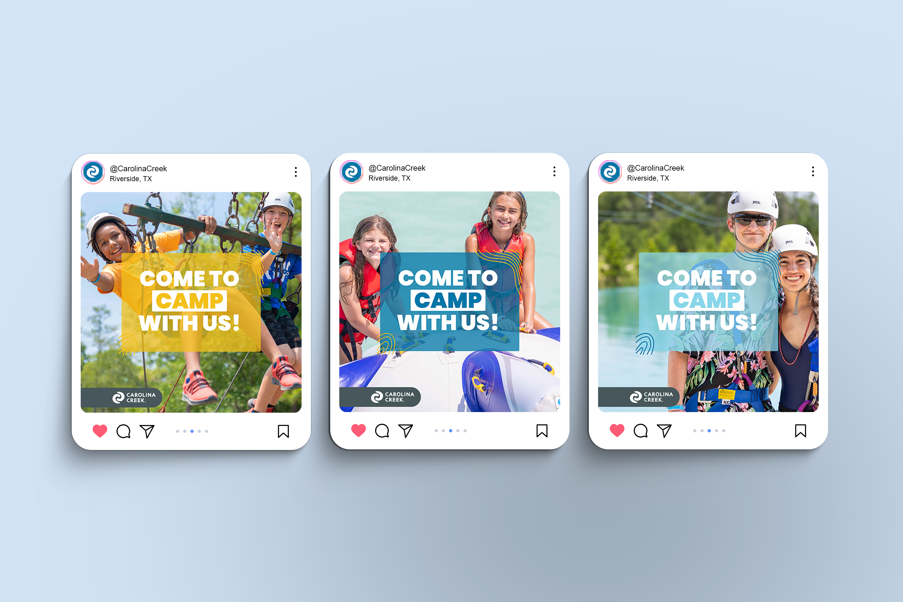
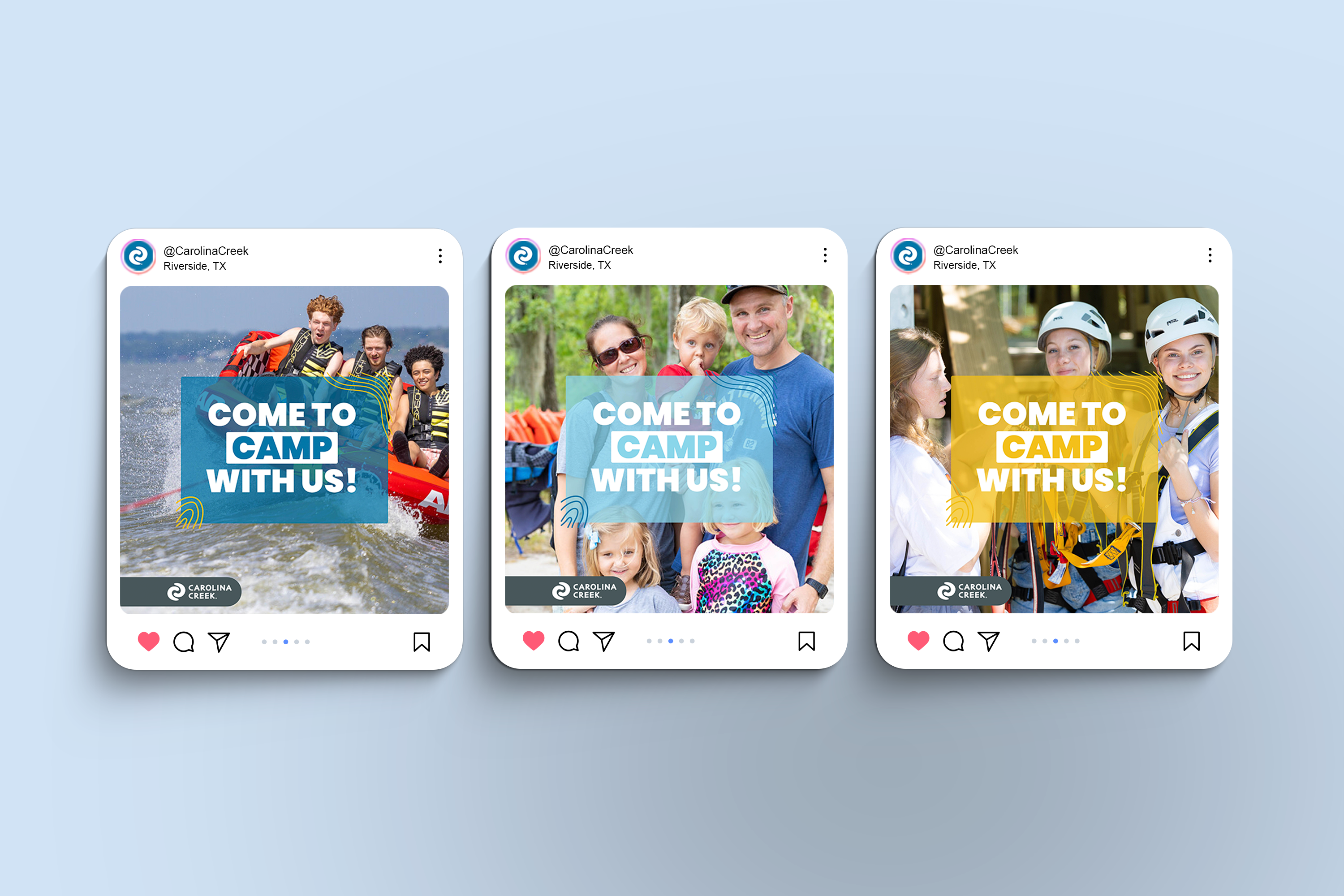
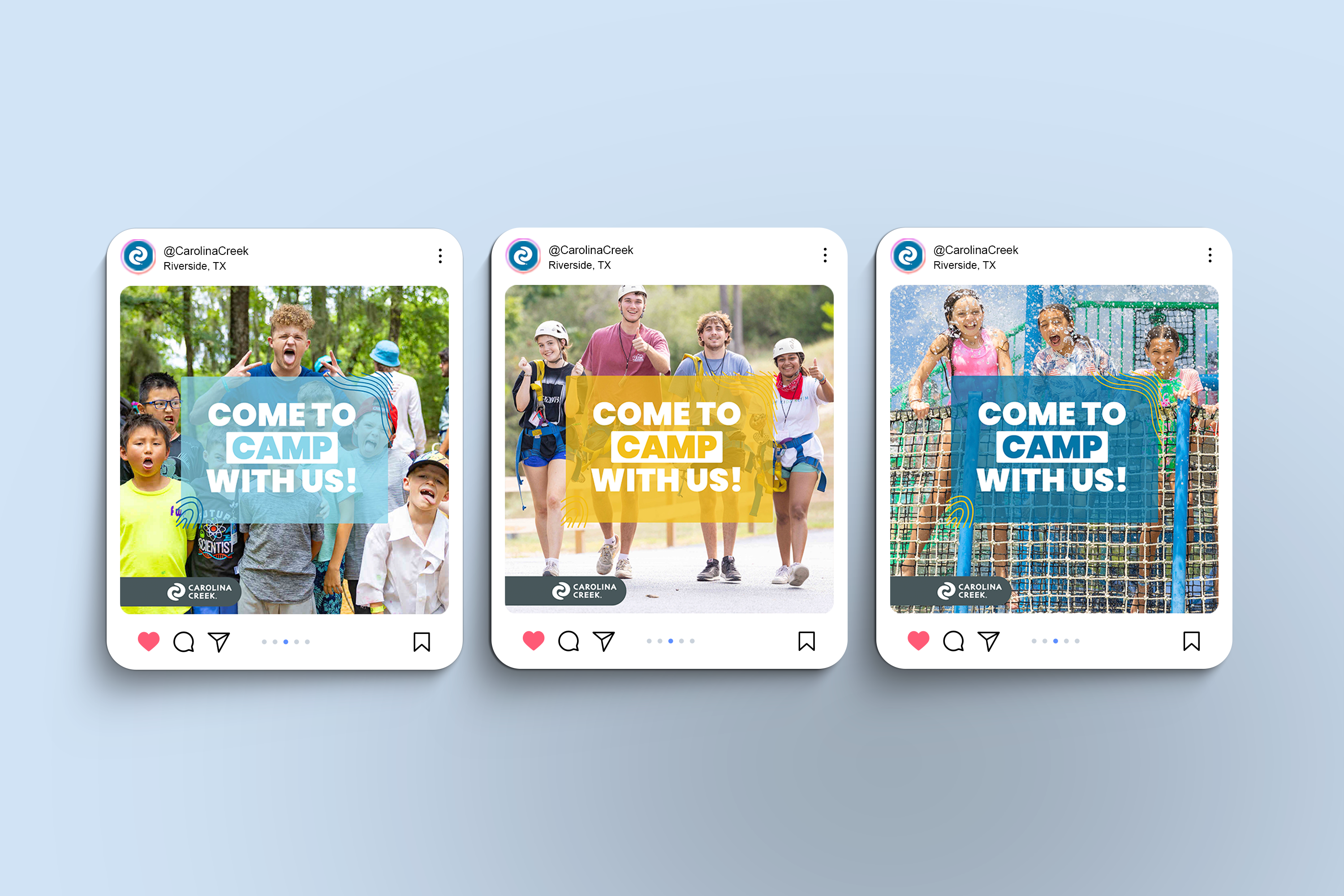
Social Media Graphics: Built templates and systems for consistent, engaging content—scalable across seasons, programs, and teams.
Brand Style Development: Led a visual “brandstorm” to define the updated look and feel. This included:
Color Palette: A fresh set of nature-inspired hues like Carolina Blue and Sunburst Orange.
Typography System: A modern hierarchy using Poppins for structure and an accent of handwritten type for warmth.
Graphic Elements: Organic textures, topography-inspired markers, photo mark-ups, and the signature “logo flag” element to tie everything together.
Layout & Structure: Grid-based cards and pinned headline flags with intentional radii for a polished but playful feel.
Brand Voice & Ethos:
We focused on a voice that’s invitational and relational—not overly polished or salesy. Visually, the brand leans clean and fresh while staying organic and grounded—reflecting the energy of camp and the authenticity of connection.